Jomo Kenyatta University Equity Leaders Chapter
A Mark for a Timeless Mission
Visual Identity
Empowerment
Community Impact
Student Leadership
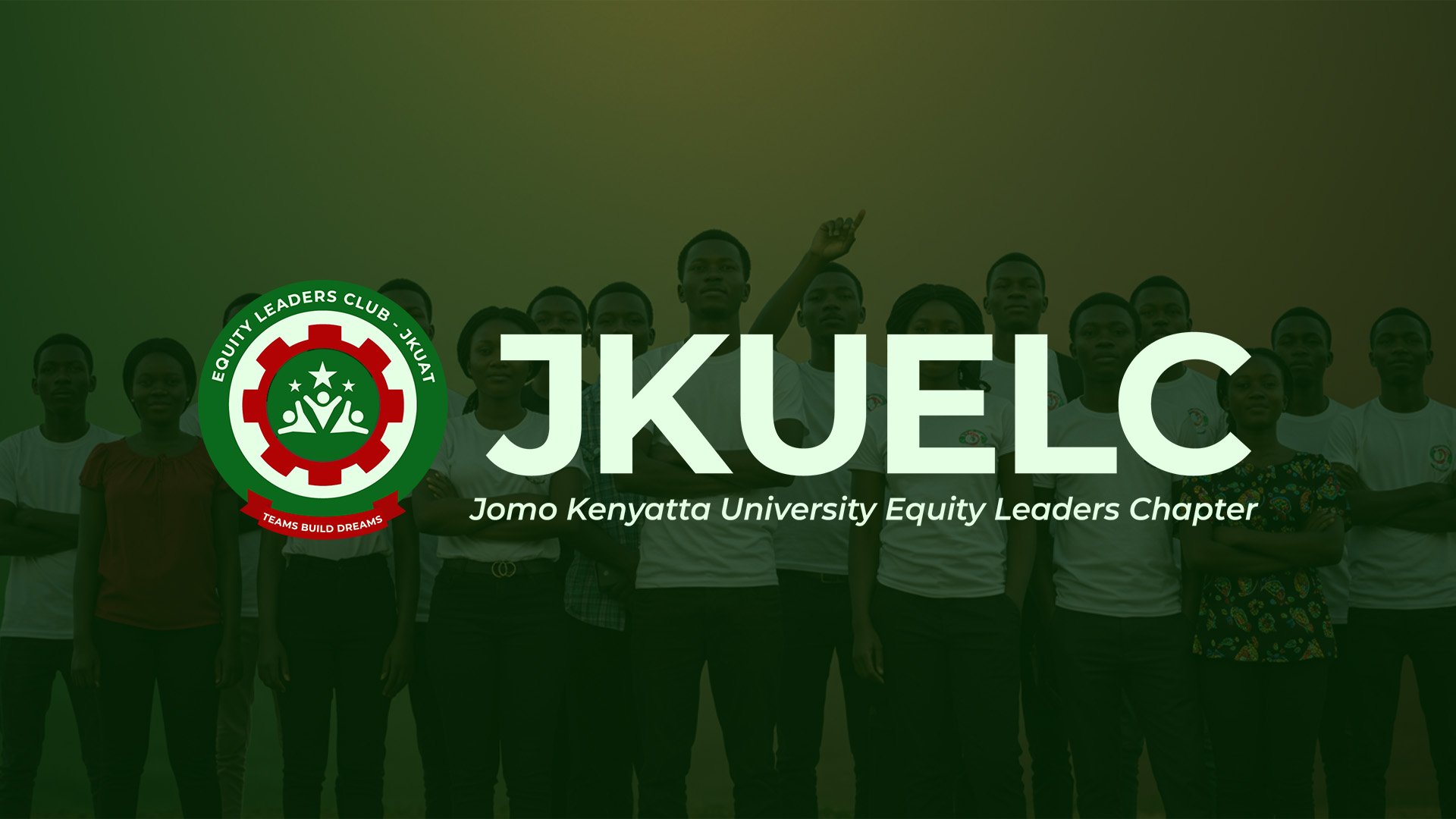
The Equity Leaders Club – JKUAT is a vibrant chapter of the broader Equity Leaders Program, deeply connected to Equity Bank’s vision of nurturing young leaders.
Rooted in leadership, mentorship, networking, and community giveback, the club exists as a platform where students live out the values instilled by Equity while adding their unique university spirit.
Being part of JKUAT, the brand identity had to balance two heritages — the Equity legacy and the JKUAT identity. The redesign was not about breaking away from the bank, but about creating a mark that better represented the club itself, while still honoring its Equity roots.
The Challenge
The client’s need was specific yet delicate:
- The Equity Bank logo at the center of the old design could no longer remain, even though the club’s foundation and connection to Equity were still vital.
- The visual identity had to preserve familiarity, respecting members’ sense of recognition and belonging.
- The redesign needed to subtly reflect the club’s four pillars — leadership, mentorship, networking, and community giveback.
- Above all, it had to embody the tagline “Teams Build Dreams” without losing the JKUAT(ness) that situates the chapter firmly within the university.
The Goal
The redesign had to be subtle yet purposeful:
- Honor the Equity heritage while giving the club its own distinct identity.
- Maintain continuity so members still felt the brand was theirs.
- Introduce symbolism that represented the club’s role, values, and future, without being a drastic departure.
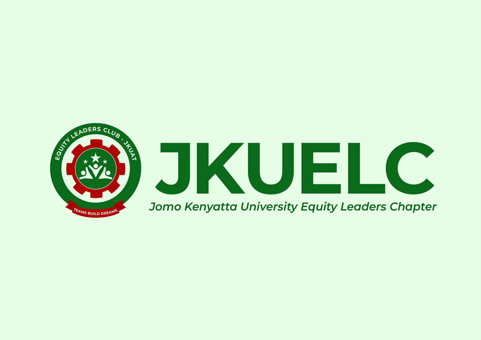
Logo Redesign
The redesign was guided by the need to honor two legacies at once: the club’s identity within JKUAT and its enduring connection to Equity Bank’s vision.
The outer gear-like circle symbolizes the industrious nature of JKUAT, representing innovation, resilience, and the continuous pursuit of progress. It roots the club firmly in its university setting, showing that the foundation of growth begins with knowledge and work. It also helps maintain the previous Logo 'Familiarity".
At the center, the new mark comes alive through human forms reaching outward and stars positioned above them. The figures represent people in community — each one distinct yet connected, symbolizing the four guiding pillars of the club: leadership, mentorship, networking, and community giveback.
The upward reach toward the stars conveys aspiration, ambition, and the boundless growth that comes when teams unite around shared purpose.
The stars themselves act as beacons of achievement and possibility, tying directly to the club’s tagline, “Teams Build Dreams.” Together, the people and stars express how the club nurtures individuals while pushing them toward collective progress.
This balance — the gear for JKUAT, the human forms for community, and the stars for aspiration — creates a logo that feels both rooted and forward-looking.
It is not only a subtle evolution but also a visual story of growth, unity, and infinite potential anchored by Equity’s enduring values.
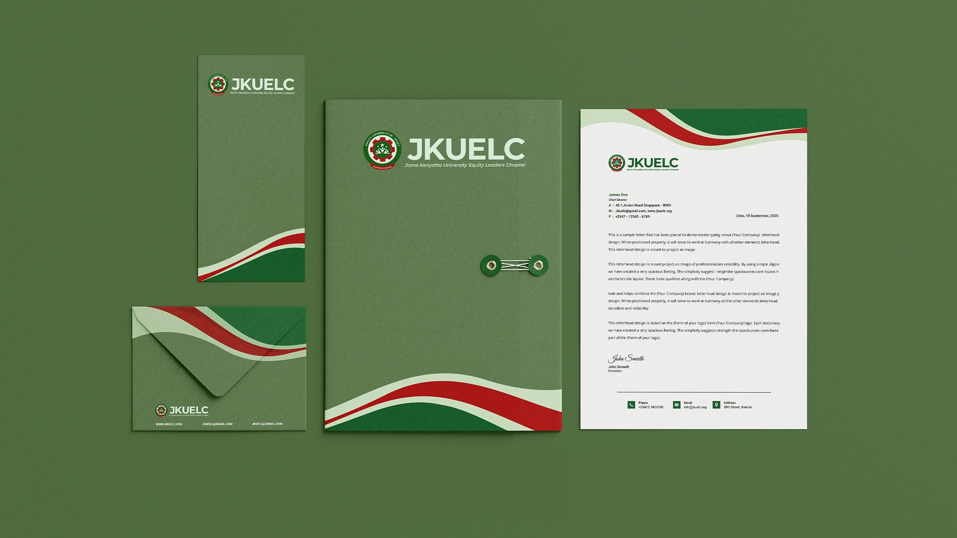
Brand Stationery

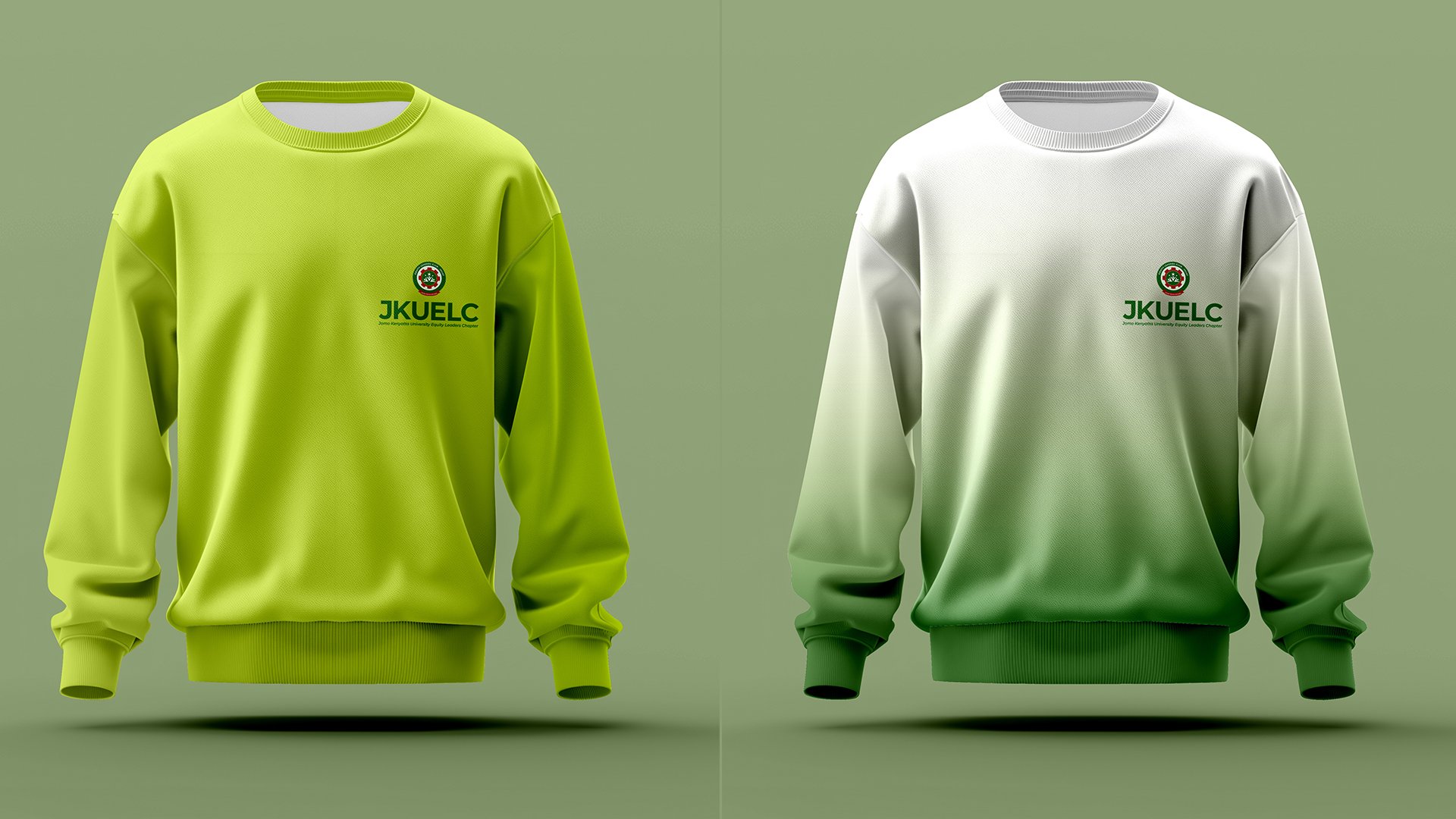
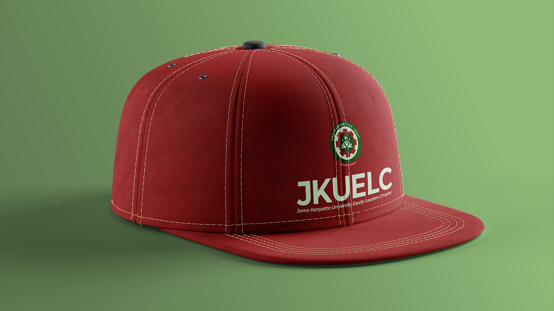
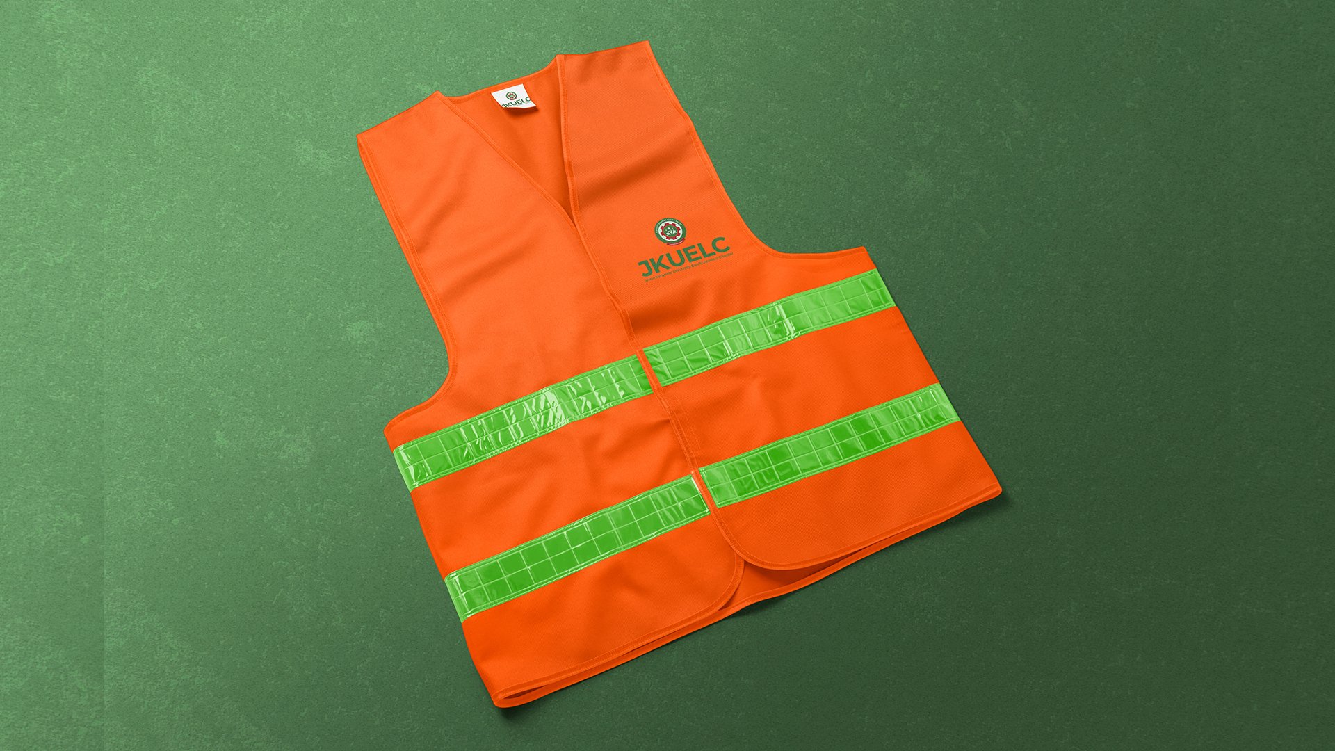
Merchandise Design


View Complete Project Portfolio
Explore the full design process, additional project visuals, and behind-the-scenes insights on our professional portfolio platform.
View Full Project DetailsTFuture Designs
Kenya's leading brand design agency specializing in brand identity systems, corporate branding, and strategic brand architecture for businesses across Africa. Our professional brand designers create visual identities that elevate your business.
Select Service
Brand Strategies & Identity Systems
Corporate Branding
Strategic Brand Architecture
Event Branding