Transforming Kenyan Market with infinite web solutions
Visual IdentityBrand IdentityTechWeb development
Building digital experiences that empower businesses, delivering not just websites, but a mark of excellence.
Coweb Lux is a Nairobi-based digital agency dedicated to helping businesses craft a bold and professional online presence.
With services spanning web design, web development, web management, and SEO optimization, the brand positions itself as a one-stop partner for organizations that want to look as strong online as they are offline.
At the heart of Coweb Lux is a belief: elegance doesn’t have to be complicated. Their approach to design and technology balances simplicity with boldness, allowing clients to stand out in the crowded digital space.
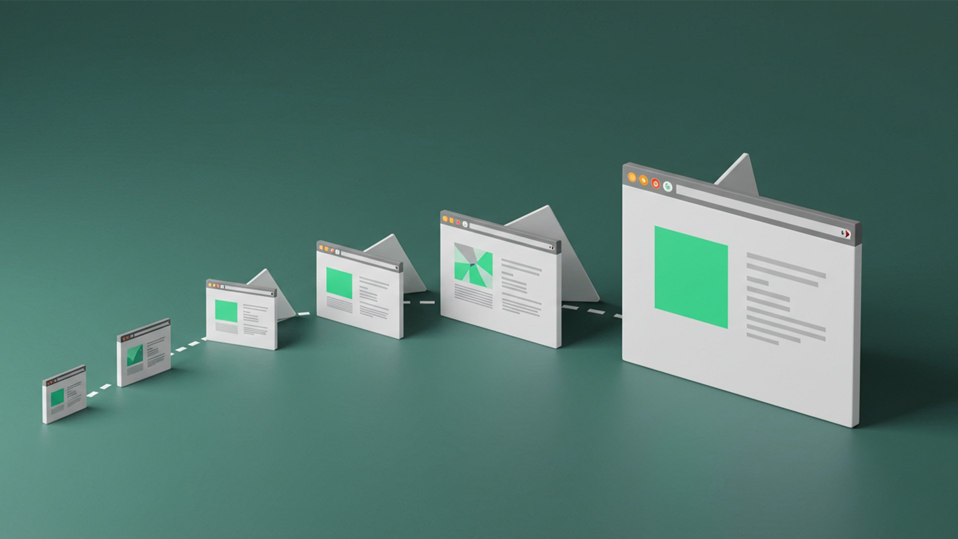
Every project is guided by a vision of limitless possibilities and continuous growth, a commitment to creating digital solutions that are timeless, adaptive, and built to endure.
The Challenge
In a crowded digital landscape, Coweb Lux faced three core challenges:
Differentiation → Standing out in a market where most agencies sound and look the same.
Clarity & Trust → Communicating expertise in a way that clients can easily understand, without heavy jargon.
Enduring Value → Showing that their solutions aren’t just quick fixes, but are designed for continuous growth and limitless possibilities.
Goal
The goal for Coweb Lux was to establish a brand that not only delivers beautiful and functional digital experiences, but also communicates a sense of endless possibility.
One thing was clear - beyond building websites, the mission was to create a brand identity that inspires confidence, suggesting growth without limits and solutions designed to endure.
We had to position Coweb Lux as more than a service provider — as a partner for continuous digital evolution. This to help the brand could stand apart as a timeless presence in an industry that often feels fleeting.
Brand Identity & Research
Market Landscape
We explored the competitive digital space in Nairobi and beyond, noticing that many agencies looked and sounded similar — technical jargon, generic websites, and little emotional connection. This highlighted the opportunity for Coweb Lux to stand out by pairing elegance with clarity.
Audience Insights
Potential clients were diverse, ranging from startups to established businesses. What they all valued was trust, transparency, and simplicity. They didn’t want to be overwhelmed with technical terms; they wanted results, clearly explained and beautifully presented.
Strategic Imperatives
From this research, we distilled four guiding principles to shape the Coweb Lux brand:
Simplicity with Boldness - A design approach that is clean and minimal, yet confident enough to stand out in a competitive digital space.
Trust & Reliability - Positioning Coweb Lux as a dependable partner, not just a service provider.
Clarity of Voice - Messaging that avoids jargon, making digital solutions easy to understand and approachable.
Endless Possibilities - Embedding a philosophy of continuity and growth, reflecting a digital partner that evolves with its clients.
Positioning
These insights positioned Coweb Lux not just as another digital service provider, but as a long-term partner for growth, offering digital solutions that are timeless, adaptive, and limitless in their potential.
Brand Creation
Naming
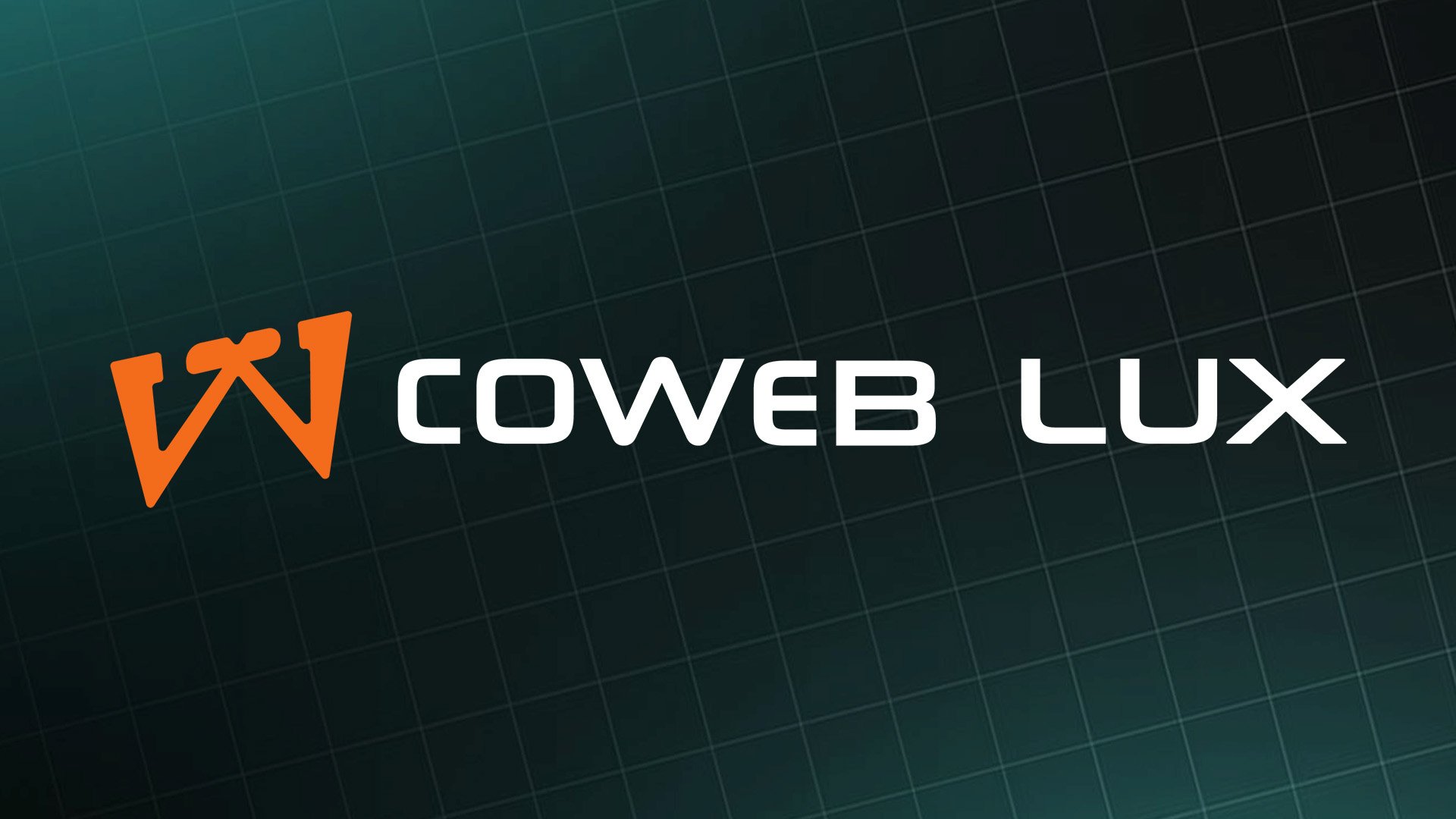
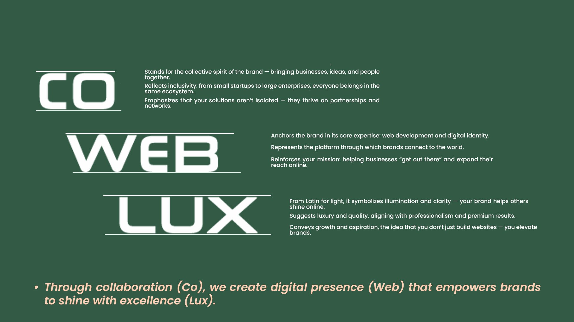
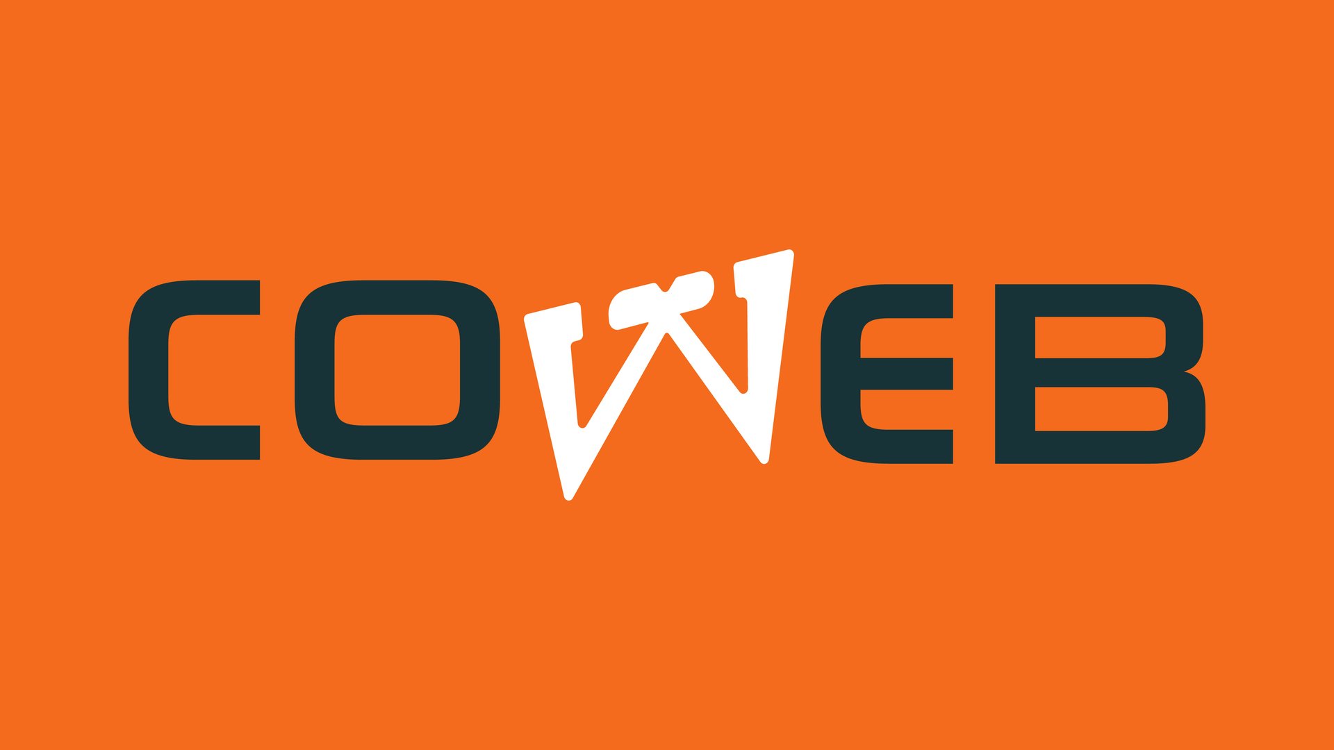
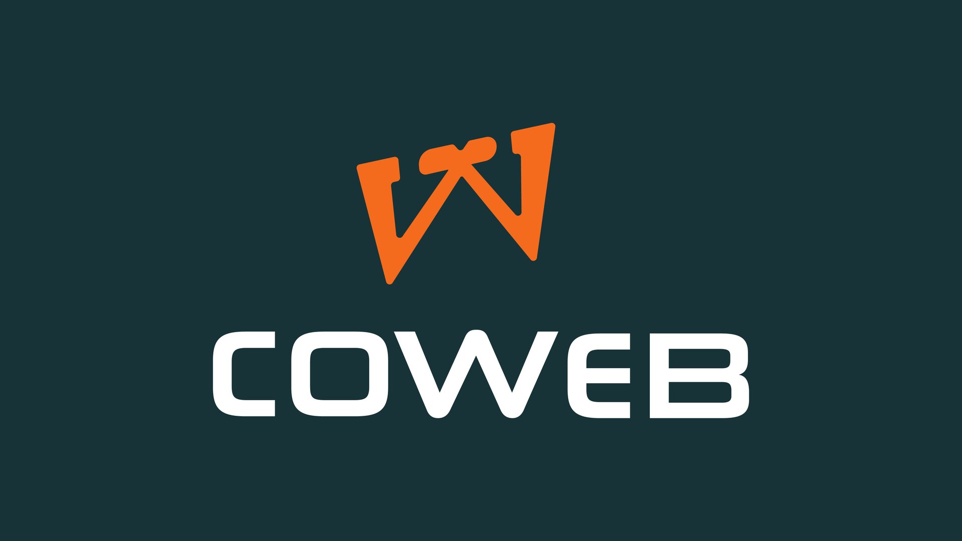
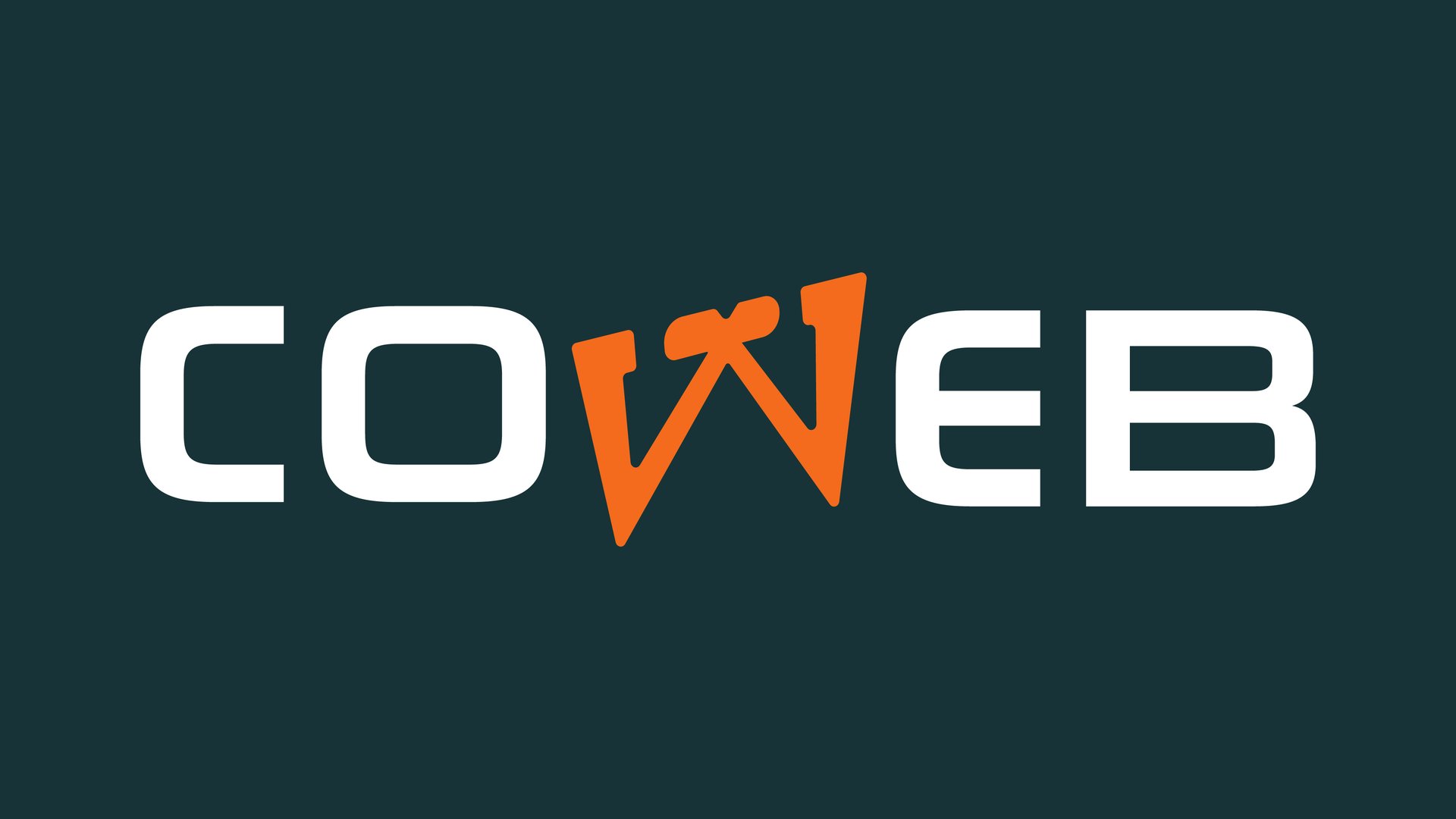
Coweb Lux — a name that fuses Collaboration + Web with Lux (light, luxury, excellence). It positions the brand as a partner in creating bold, premium digital experiences that illuminate opportunities for growth.
Logo Creation
Due to the client’s emphasis on a strong identity and their vision of infinite possibilities, we rooted the design process in creating a mark that was both foundational and aspirational.
The goal was not just to design a logo, but to craft a symbol that would embody the enduring spirit of Coweb Lux — a partner that stands for continuity, growth, and clarity in the digital space.
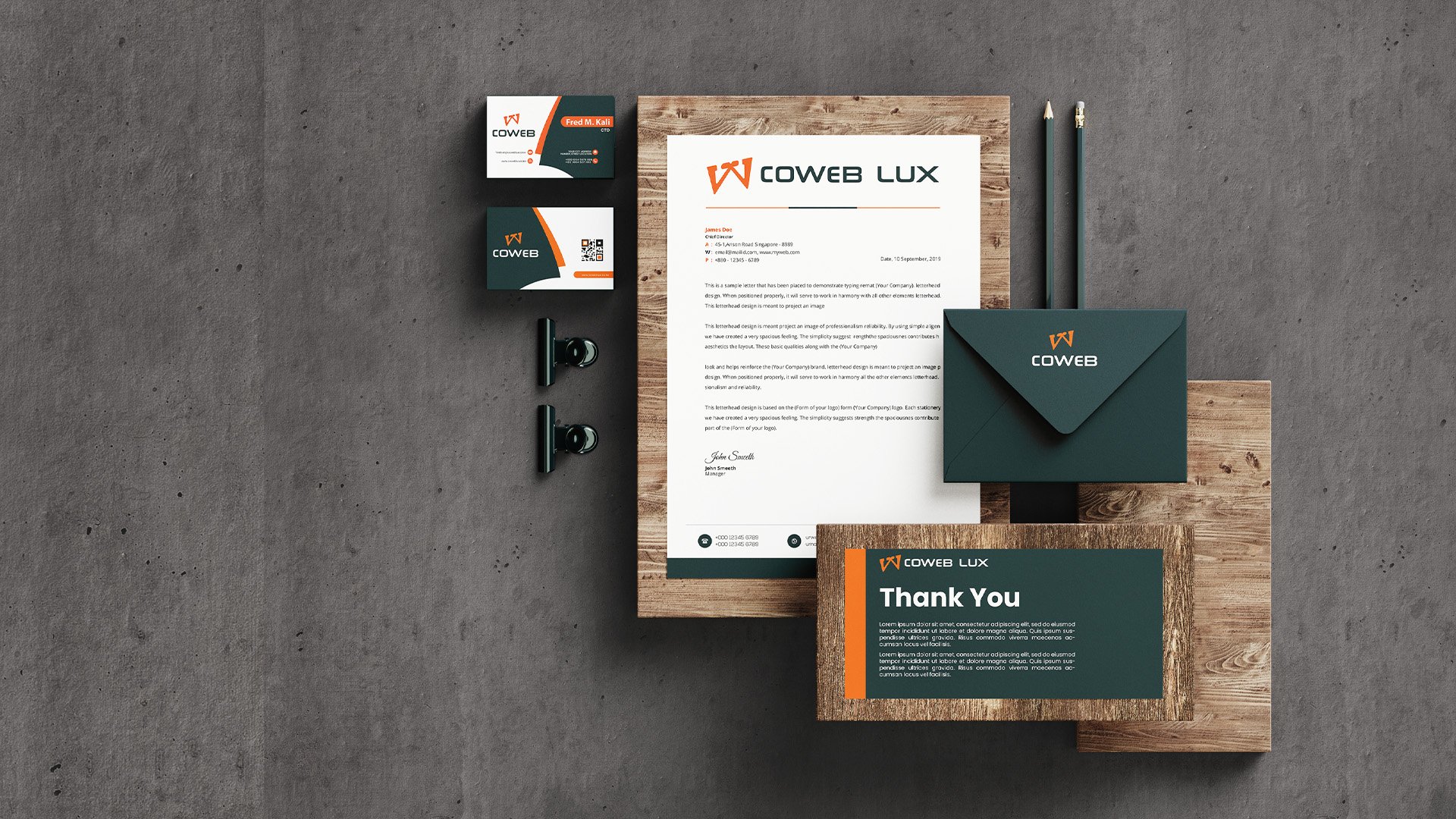
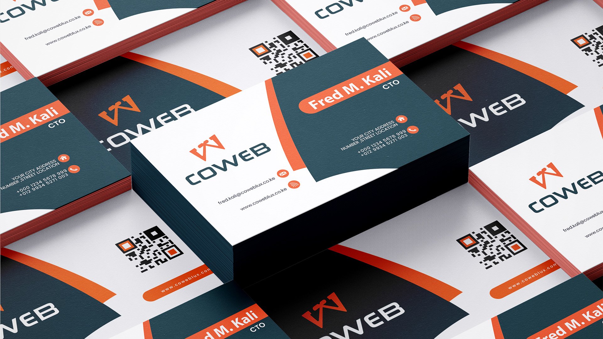
Through this lens, the stylized “W” emerged as the centerpiece. Its flowing form subtly suggests infinity, representing boundless opportunity, while its bold structure conveys stability and confidence. Paired with a clean wordmark, the logo achieves a balance between elegance and strength, mirroring the brand’s philosophy of simplicity with boldness.
Tone of Voice
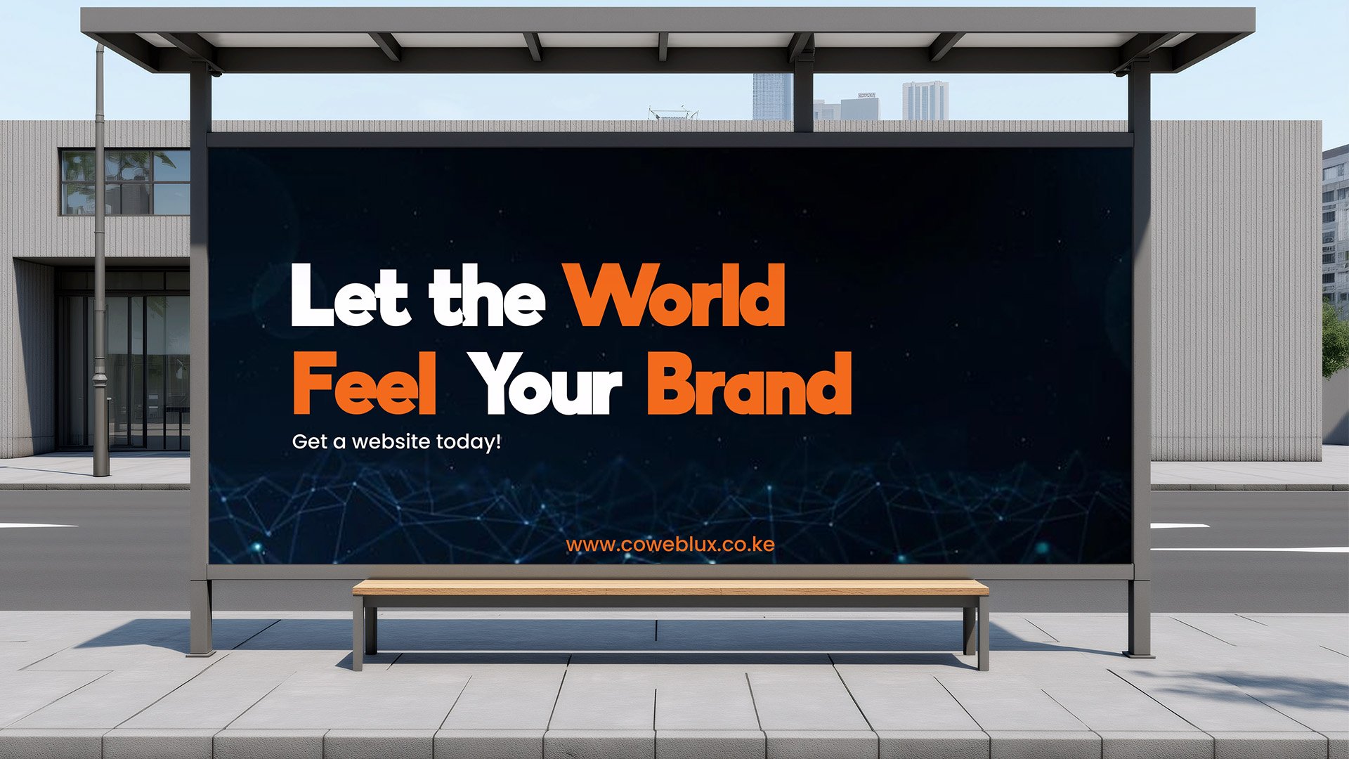
Direct, human, and confident. The brand avoids unnecessary jargon, speaking in a way that makes complex digital solutions feel approachable while still maintaining authority.
View Complete Project Portfolio
Explore the full design process, additional project visuals, and behind-the-scenes insights on our professional portfolio platform.
Kenya's leading brand design agency specializing in brand identity systems, corporate branding, and strategic brand architecture for businesses across Africa. Our professional brand designers create visual identities that elevate your business.